Linear Regression Activity with the True Colors Personality Test
I want to share a linear regression activity I did with my Algebra 2 students to introduce the topic of regression. I combined linear regression with the True Colors Personality Test that I had originally wanted to do with my students at the beginning of the year.
The summer after my first year of teaching, I attended a week-long Common Core Training workshop called OGAP – Oklahoma Geometry and Algebra Project.
One of the first activities we did was a True Colors Personality Test. I had never done this test or even heard of it before. After choosing which words best describe you, the test will tell you whether you are primarily Blue, Gold, Orange, or Green. Blue people value relationships. Gold people value duty and responsibility. Orange people value freedom. And, green people value information and knowledge. I was not surprised to find out that I was almost pure Gold. My perfectionism, my obsession with to-do lists, and my need for order attest to this.
I’ll be honest. At first, I thought this activity was kind of silly. Okay, I’m gold. Now what? But, as the week progressed, the other teachers and I were constantly realizing how knowing someone’s color sheds a lot of light on why they do what they do. I thought this would be beneficial to do with my students at the very beginning of the school year.
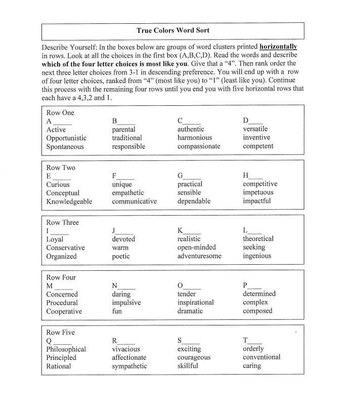
Creighton has a great copy of the personality test that has a full explanation of what the different colors mean. Let’s just say there is a whole lot more to the colors than the one-word descriptors I wrote above! I also found another great printable version that might be of interest to you.
Even though I had wanted to do this with my students at the beginning of the school year, I was ready to jump straight into math after two days of getting to know you activities. I decided to save the activity for later in the year. My chance to do this activity came when I was ready to introduce my students to linear regression.
We ended up spending about 2/3 of our fifty-minute class period taking the personality test and learning about our results. My kids got really into this! I may have encouraged their interest a little by telling them this personality test would help them better understand their boyfriend/girlfriend. I ended up having to make copies of what each color means to give to the students because so many of my students wanted to give the personality test to someone and interpret the results.
The last third of the class period was full of data collection and graphing calculator action. I made a table on the Smart Board. Number of People vs. Time. I asked one student to volunteer to use the stopwatch on their phone to time the students for this activity. The students at table one took turns saying their name and their color from the personality test. We stopped the time and recorded the number of students and total time. We repeated this with table one and table two. We repeated it again with the students at tables one through three. Eventually we got a time for the students at all five tables saying their name and color.
Next, we had a short discussion about which variable was dependent and which variable was independent. I have been making a HUGE deal about independent and dependent variables this year. This was our first time ever to explore the spreadsheet function on our TI-Nspires. We entered the number of people in column A and the amount of time in seconds in column B.
My favorite thing about the TI-Nspire is the process that you have to go through to make a scatter plot. First, you enter your data in the spreadsheet. Then, you insert a new Data and Statistics page in your document. This will make the calculator place your data points randomly on the screen. Once you figure out what your independent variable is, you click on the x-axis and choose the independent variable. The data points will start dancing across the screen to their proper homes. Then, you click on the y-axis and choose the dependent variable. After some more dancing, your scatter plot is done! It’s fun to watch, and I love that students really have to think about which variable belongs on which axis!
Together as a class, the students walked through the process of performing a linear regression of the form y=a+bx. This summer, I went to two separate week-long workshops that told me that I should stop teaching y=mx+b and start teaching y=a+bx. The first time I heard that, I wrote it off as crazy talk. After all, y=mx+b and I have been friends since middle school. But, the second time I heard that, I started to think that there might be some merit to the idea.
This year, I am experimenting with teaching y=a+bx for the first time. I’m still not quite sure how I feel about it, though. I guess time will tell. (I also would have never thought that I would have given up my trusty TI-84 for a TI-Nspire, but that has also happened. I was helping a student with their TI-84 on Friday, and it was such a weird experience. I’ve started to forget where some of the buttons are already!) We discussed the slope and the y-intercept and their meaning in this situation. We also discussed reasons why our data was not perfectly linear. The bell rang before we could delve much deeper into it.
I have also done this activity without having the students share results. At one workshop, we called this “Pass the Buck.” The presenter took a dollar bill out of his wallet and gave it to someone sitting at the first table. That person said their name and passed the buck to the next person. We stopped at the end of the first table and recorded the time. The buck made it’s way back to the original person, and we timed the amount of time it took to pass the buck to the end of the second table. This process continued until the buck had made it to every table.