Area and Perimeter Posters
This blog post contains Amazon affiliate links. As an Amazon Associate, I earn a small commission from qualifying purchases.
Today I want to share some area and perimeter posters I created for my classroom.
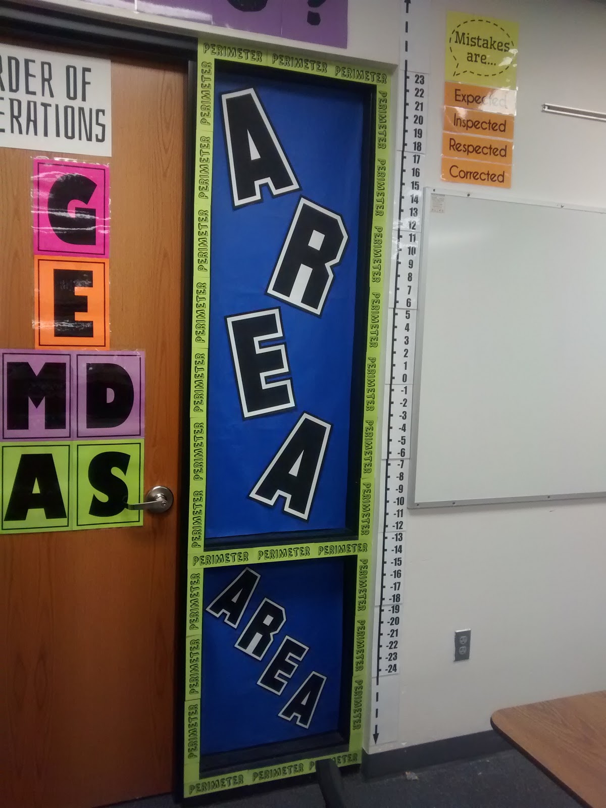
I spent another afternoon working in my classroom today, and I feel like I actually made a lot of progress. I still need to start working on actual math lesson plans at some point.
My principal e-mailed out the schedule for staff development today. That’s a definite sign that summer is coming to an end quickly.
We have PD on August 18th and 19th. Kids come on the 22nd. Less than 2 weeks!!!
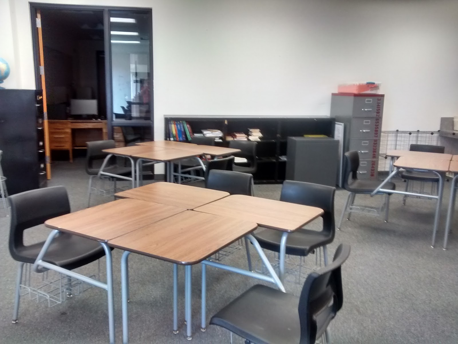
My new building is designed so that there is a “math lab” adjoining my math classroom. Therefore, I understand why there is a door connecting the two rooms.
What I don’t get is why there is a window that lets you look into one room from the other. Because we are short on classrooms, this room is actually being used as a middle school classroom.
I definitely don’t want my high school students checking out what the middle school students are up to or vice versa.
Here’s a before picture of the door and window:
I chose an area and perimeter theme because this is something my students often get confused. This year, I’m teaching Algebra 1 and Math Concepts (a class for 9th graders not yet ready for Algebra 1).
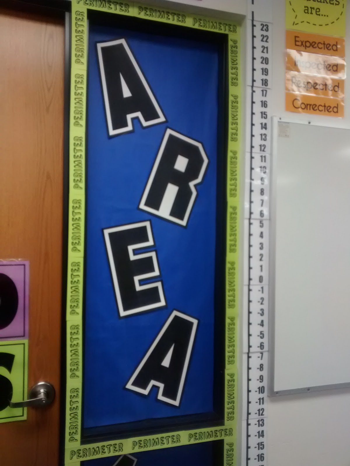
I think both classes should find this to be a handy reference.
This display was inspired by this pin which my sister sent my way.
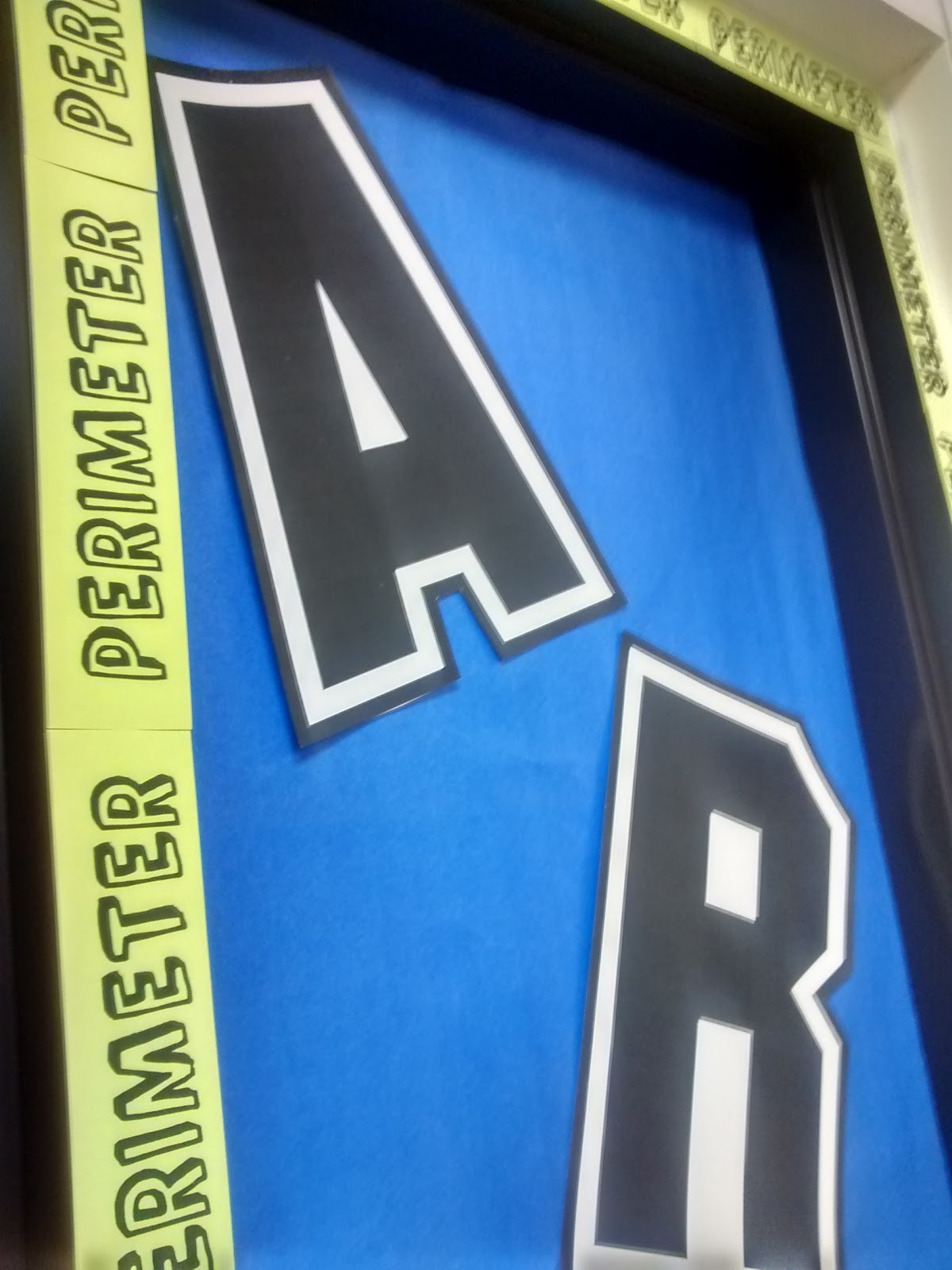
The blue paper is from the big rolls of butcher paper that I imagine most schools have. I hope the other teacher likes blue.
If not, I guess she can cover the other side of the window with the color of her choice.
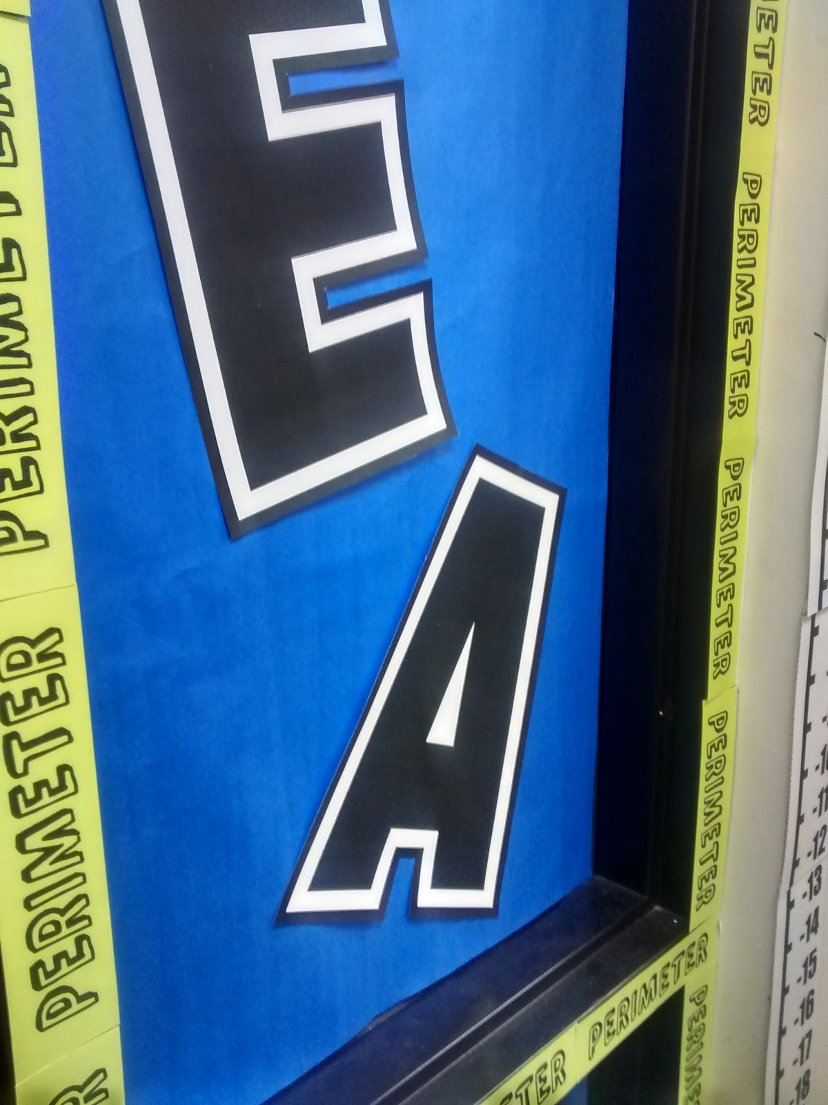
For the top part of the window, I printed the letters in AREA on 11 x 17 cardstock. I got a package from Amazon, and it comes in so handy for decorating and making posters!
I tried to make these letters using Microsoft Publisher, but I discovered that Publisher requires that all fonts be size 999.9 or smaller.
This was not big enough to fill an 11 x 17 sheet of paper, so I ended up having to make them in word.
The font is SF Collegiate. I chose this font because it was easy to cut around, and I didn’t have to worry about cutting out the middle of the A’s! I ended up using font size 1240.
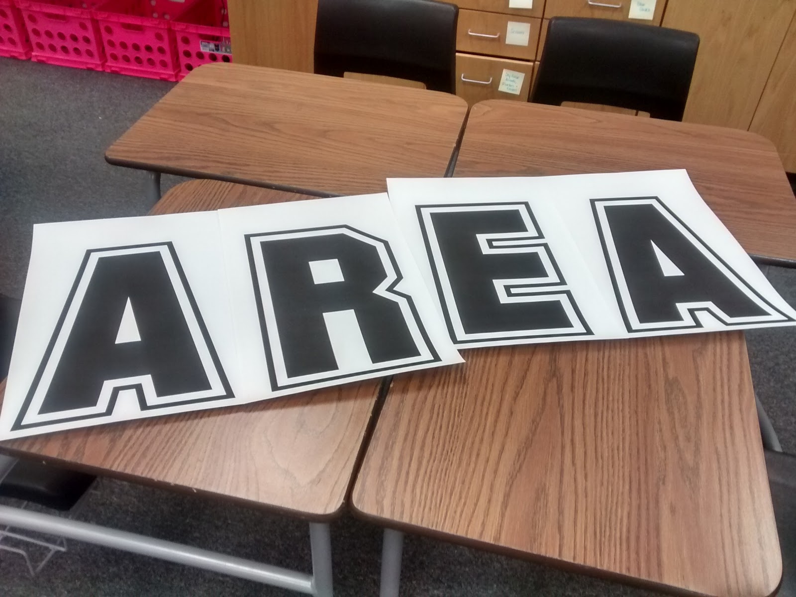
Originally, I planned to hang them vertically, but they just barely fit. I guess that’s what happens when you use 1240 size font…
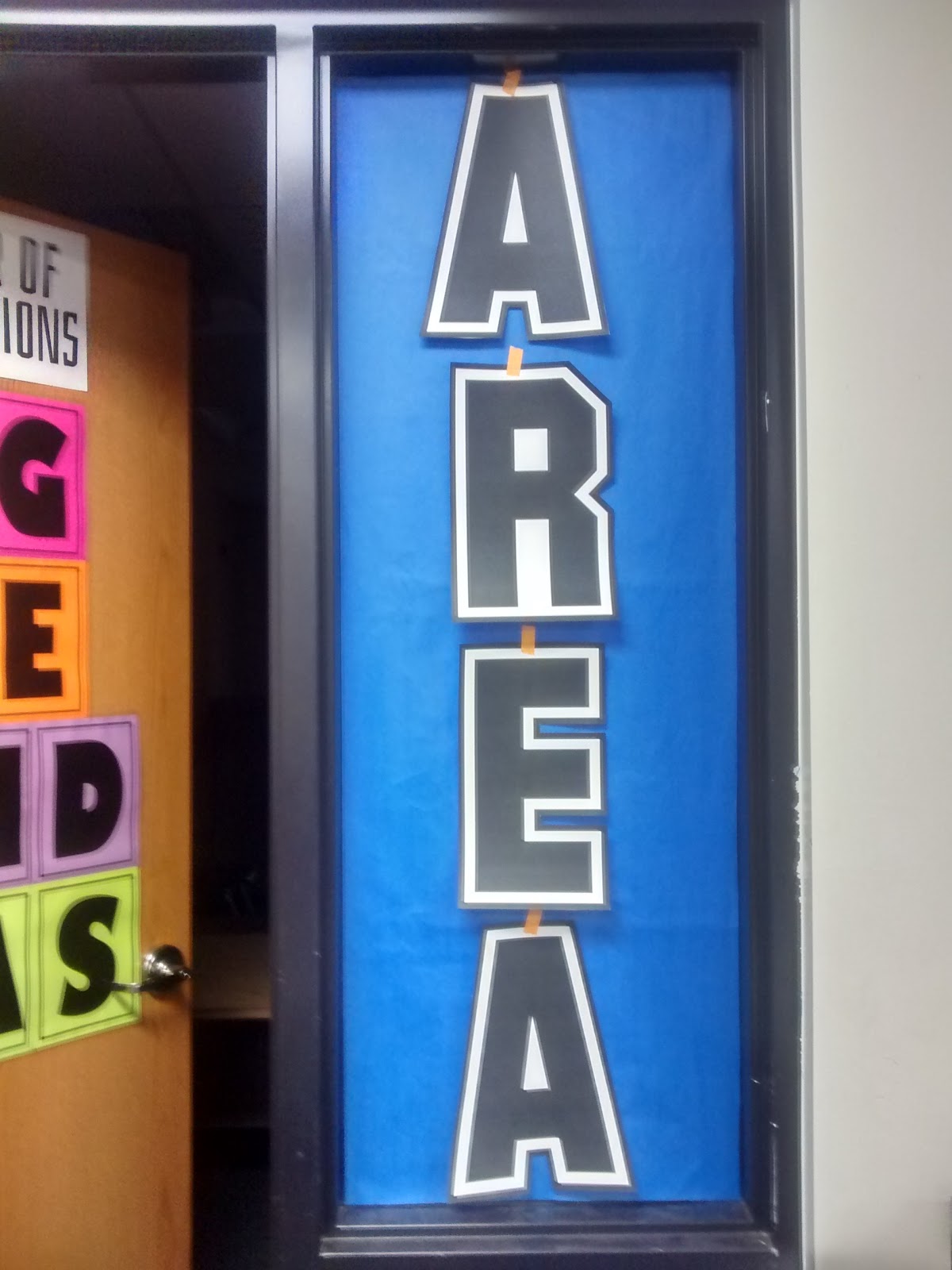
This made me realize I probably couldn’t put my perimeter border inside the window on the blue part. I would have to put it around the black edging. That ended up okay, though.
I printed my Perimeter edging 5 to a page. This meant I could use the paper chopper to cut 0.5 inches off the top and bottom. Then, I just chopped them into two inch strips.
My new school’s paper chopper makes cutting things so easy. My old school had an ancient paper chopper that liked to chew the paper at times.
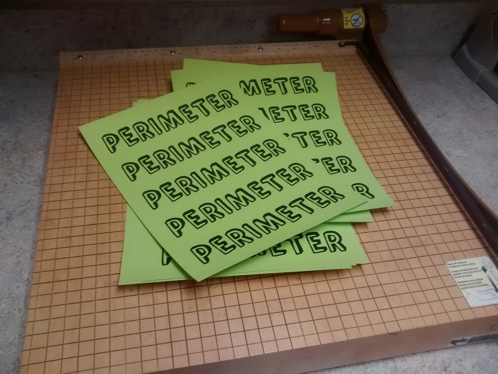
Thankfully, the proportions of my window played very nicely with these strips. I only had a small gap at the bottom of the window where I had to add some extra green paper to cover up where the trim was missing.
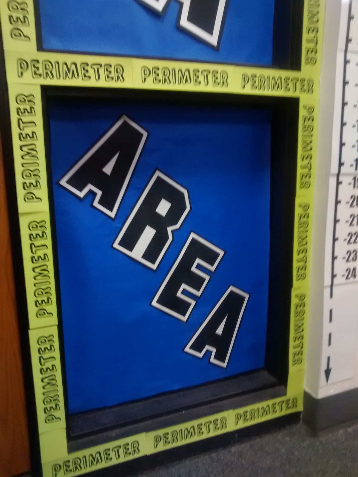
The AREA letters at the bottom were a last minute addition. I printed the SF Collegiate letters in size 710 on just plain copy paper.
Files for Printable Area and Perimeter Posters
Click here to SAVE the file to your device.
AREA – Large Posters (PDF)
3612 saves – 10.30 KB
Click here to SAVE the file to your device.
AREA – Small Posters (PDF)
3567 saves – 10.35 KB
Click here to SAVE the file to your device.
Perimeter Edging (PDF)
4230 saves – 92.95 KB
Other Posters of Interest
Interested in any of the other posters you might have saw lurking in the background? Here are the appropriate blog posts:
Growth Mindset Mistakes Poster
Want even more posters? I have an entire page on my blog dedicated to all of the posters I have made for my classroom over the years.



Wow — I have almost the same kind of window … well, I have four of them… between my little satellite "Academic Development Lab" and the main tutoring place. We certainly don't need to be looking through all of them(though I *do* like to be able to see what's going on out there). Area and Perimeter R Us!!
🙂