Best Line of Best Fit Contest
This blog post contains Amazon affiliate links. As an Amazon Associate, I earn a small commission from qualifying purchases.
Earlier this week, I had the privilege of having Kara Tobey observe my classroom. She’s a first-year math teacher in Little Rock, AR, and she’s got an awesome blog that you should definitely check out: Algeotrigcal. I especially love the questions tab she has on her blog where she writes about questions she is pondering in regards to her teaching.

I took advantage of having another adult in the classroom, and I roped Kara into helping judge a contest between my students. We’re finishing up our last unit in Algebra 1 that is all about data analysis. Specifically, we’ve been working with scatter plots for the last week or so of class. Before taking a quiz over writing a line of best fit, I decided we should do one last review problem.
I spent probably 5 minutes searching google images for an appropriate scatter plot. Eventually, I realized it would probably be faster to just make my own in Desmos. Yeah. I should have thought of that in the first place!
Eventually, I came up with this scatter plot:
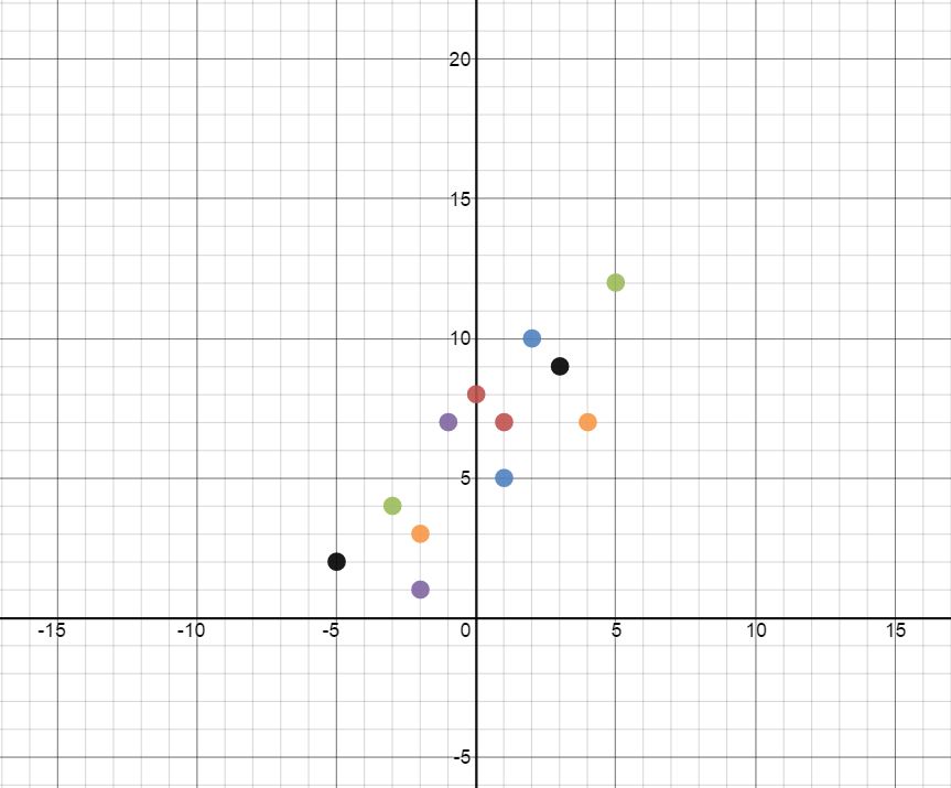
Side note: Projector Mode in Desmos is AWESOME.
I set a timer for five minutes and had each group of students come up with their own line of best fit.
Last period, the four groups came up with these four lines of best fit:
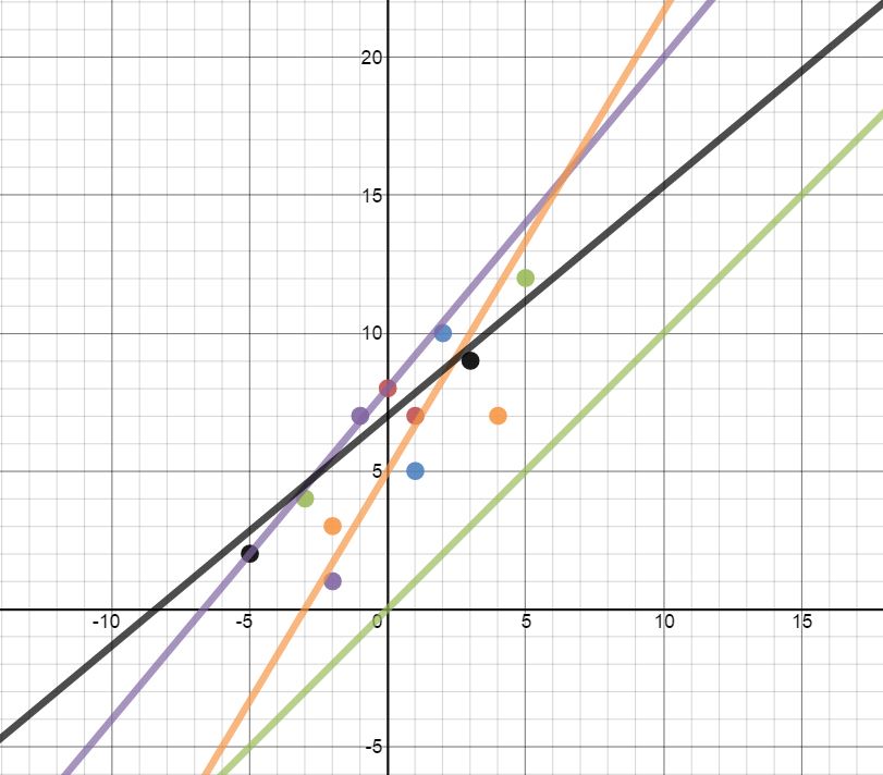
The group that made the green line of best fit thought that they were supposed to make their own scatter plot and come up with their own line of best fit. They didn’t realize they were supposed to use the scatter plot that was displayed on the SMARTBoard.
This tells me that in the future, I should print a copy of the scatter plot for each group and place it in a dry erase pocket to avoid confusion.
MATH = LOVE RECOMMENDS…
I cannot imagine teaching math without my dry erase pockets! They instantly make any activity more engaging and save me countless hours at the copy machine since I can use the same class sets of copies year after year.
Here are my current go-to recommendations:
If you don’t have a classroom set of dry erase pockets, you could also use heavy duty sheet protectors. But, I highly recommend investing in a classroom set of the pockets since they are so much more durable.
Each group presented their equation one at a time. I graphed each equation in the same Desmos file, and as a class, we decided if the line would get an A, B, or Not Yet on a quiz. A lot of great questions arose as a result of looking at the other group’s graphs. The resulting discussion made this a whole lot more useful than just a single practice problem.
When I announced that the group with the best line of best fit would win some earth-shaped stickers, the kids groaned because it wasn’t candy. Of course, these are the same kids who were later trying to talk the winning group into giving them their stickers… Thank you so much, Kara, for jumping in and judging the line of best fit contest so I didn’t have to be the bad guy. 😉
Here’s a link to my Desmos file in case you might find it useful. 🙂





GREAT idea! So which color wound up winning the stickers? I'm guessing orange?
Yep! Orange : )
Thank you for the kind words. It was fun!
This is a great warm up for me!! Thank you for sharing…my question is did you give the students the ordered pairs (that are shown on the desmos file) or just the points with out the associated ordered pairs? Thank you, Summer Little
I love your blog, so many great ideas! I also have very little technology in my school (high school math also), so it is nice to see what you do to keep the students interested. Like card sorts and card stacks, and using Desmos. I love this activity with the line of best fit. I also read about how you got students to like point slope form by having them check their answers on your computer with Desmos. I plan on making a variation of that this year with graphing polynomials! Thank you for your blog and sharing your ideas with other teachers!
If you type "y1~mx1+b" into desmos (assuming your table is labeled x1 and y1), it will plot the Least Squares Regression Line, which is the mathematical best line of best fit. If you pop that in at the end, your students could see for themselves which line is the closest to the LSRL. That might decrease the number of groans about bias from the judge. 🙂
I did not know that. Thanks for sharing!